Thursday, March 21, 2019

Music Video

Flossing Music Video


Song Choice

For the music video project, my group chose the song, Flossin, by Russel Horning. Commonly known as backpack kid. The song was produced by DJ Suede and was released in November 2017. The song is based around Backpack Kid's famous dance, called the Floss. It has a lighthearted and energetic theme.

Process

During pre-production, we had to do the project sheet, lyric sheet, and storyboard. I did the storyboard while others did the project sheet and lyric sheet. When creating the storyboard, I had to sketch each shot and describe the shot type. The struggling began after pre-production. Our film schedule constantly fluctuated and someone always canceled last minute. Filming was very poorly planned. We were never able to finish filming sadly. While filming, I was an actor. I also helped Andrew plan the shot. As for post-production, most of the editing was done by Andrew.

My Role

For the most part, I was an actor for the video. I also helped here and there with other things like pre-production and filming.

What I Would Do Same/Differently

I wish my group had chosen a music video that centralized around one person so it wouldn't matter if someone couldn't make it to film.

Conclusion

In conclusion, it's very important to make sure you have an open schedule before agreeing to be an actor/actress in videos. If people keep canceling filming, it will affect everyone in the team.

Tuesday, March 19, 2019

Vector Portrait


Pre-Production
When deciding on the photo of myself to use, I didn't have many to choose from. I ended up reusing the same photo I took for the pop art project. I airdropped it to my computer, put it in photoshop, cropped it to 8 inches by 10 inches, exported it, then put it in adobe illustrator. I had two artboards in illustrator, one for the original image, and one for the vector portrait.

Production
This project taught me how to customize my grid so I could create poly vector portraits. What I did was create a bunch of random triangles, and I tried to put bigger triangles in less detailed areas and more smaller triangles in detailed areas, such as ears, eyes, mouth, etc. Then I colored it in using the eye dropper tool, so the colors would be very close to the original image.

Post-Production
I am pleased with the final poly vector portrait. The portrait resembles me quite well. Without looking at the original image, I'm sure most people that know me could guess that it's me. Also, the colors look nice together. The only thing I wish looked better are the eyes. It's very hard making good eyes out of triangles.


Friday, March 1, 2019

Typography Project


Pre-Production

The pre-production process consisted of nothing more than searching google for quotes. To find quotes, I just googled quotes from certain historical figures and presidents. Some examples of people would be Leonardo da Vinci, Gandhi, George Washington, etc. When I was choosing quotes, I made sure it was a quote that I related to or agreed with.


Production

When I was creating the typographies in Illustrator, I learned that it's good to use two or three fonts. It's also good to put emphasis on the more important words by increasing the font size, making it bold, or using a font that stands out. I prefer making colored typographies because it's a lot less boring to look at. Colors can also be used to put emphasis on words. In one of my typographies, it says "...bad one." Since I wanted to give these words a negative connotation, I colored them red, because the color red is often associated with bad.

Final Production

I really like how my typographies turned out. I think the fonts, font sizes, positioning, and colors all work very well with each other. The only thing I don't like is the lack of graphics/borders. I added a simple border on my first typography and I put in a few simple graphics in another one but I feel like I should've used more.


Monday, December 17, 2018

Performance Review


Projects

Infographic:

Near the end of the semester, we had to research and design an infographic from scratch. Although I am not yet done with it, I have finished the research and graphics. A challenge I came across was with using Adobe Illustrator to make the graphics. I had very few experience with Illustrator at the time so I didn't know what I was doing. Even after I learned the pen tool, which was vital for the graphics, I still wasn't very good at it. Some feedback I received was that I didn't make very many graphics. Throughout the process, I stuck with the drawing from my sketchbook. I didn't change much. My overall opinion on my graphic design work so far is that I'm definitely improving.

Pop Art:

For this project, I had to photograph a person and add a pop art style to the picture through photoshop. This project took weeks to make. My challenge with this project was time. I'm a bit perfectionist so I spent a lot of time trying to make it perfect. In this project, I learned about Andy Warhol and the pop art style. The only feedback that I received for this project is that it was good.


Panorama 

For this project, I had to combine related pictures into a panorama. I chose to use pictures I took in Missouri. This project took me a week or two to create. My challenge for this project was a lack of creativity. I couldn't think of a fun and creative way to combine my pictures together. I ended up being unoriginal and just putting the pictures side by side. I learned how to create a panorama. I didn't receive feedback and I didn't change much from my original idea.

How I Used My Time

For most of these projects, I used my time well in class. Especially with the pop art project, I did as much as I could in the time I was given. Sometimes, I even came into class during Raven 50 to work. There were some days where I needed to work on homework from other classes but other than that I used my time well. Outside of class, I sometimes practice with photoshop.

Strengths

I'm much better in photoshop than other graphic design software. Within photoshop, I did best when I created my pop art project. Pop art was more fun for me so I put more effort into it, thus making me better at it. I also did good at photoshop challenge #1.

Weaknesses

My biggest weakness was creating my panorama. I'm also not very good at communicating. 

Summary

I loved learning how to use photoshop. Something I would like to change is how I sometimes work on other classes' work during this period. My overall takeaway is that I enjoy graphic design for the most part. In the next year, I would like to further improve my graphic design work.

Sunday, November 18, 2018

Watercolor Transfer Prints


How I Created my Watercolor Transfer Prints

1. First, I went into photoshop and reflected both of my images that I wanted to print and I made one of them black and white. (Making it black and white makes the watercolor more visible.)

2. Then, I printed the images out of the printer.

3. Next, I put watercolor onto watercolor papers.

4. After that, I put mod podge onto the images I printed out.

5. Next, I put the images face down onto the watercolor papers.

6. Finally, after the mod podge dried, I put water on my fingers and rubbed off the paper.

Reflection

I did most of it well although I wish I put more mod podge on the pictures in the beginning. It took me longer than it should have to rub off all the paper but at least the prints turned out alright.


Monday, November 12, 2018

ONW Procedures


What was the concept that our group identified for the assignment?

Our group was required to have an idea for an educational video on how to do something at ONW. The concept my group decided on was how to check out a book. Later on, we also included how to return a book.

What was the process?

After we decided on the video we were going to make, we began storyboarding. On a large piece of paper; we put beginning, middle, and end. In the beginning, we wrote that the student would grab a pass to go to the library. In the middle, the student checks out a book. In the end, a different student returns their book. After we wrote what would happen, we planned the camera shots. That was the storyboarding process. Next, my group recorded the footage which was unfortunately on a day I was gone. Then, each person edited their own video with the footage.

What was my role in the process and what did I learn?

I was the director so my group relied on me to make decisions and communicate our ideas with the teacher during storyboarding. I learned that I do not like being a director.

What would I do differently? Why?

I was kind of an indecisive director so I would've liked to have been more decisive. I also wish I could've been there for filming so I could've helped my group.

What would I do the same? Why?

For the most part, I liked my editing. I think it flows nicely from scene to scene and it gets the message across.

What experiences will I draw from to enhance my next project?

I'm improving in my editing which is something I'll need to do to enhance future projects.


Tuesday, October 16, 2018

Printing Processes


Relief Process

In the Relief process, paper is pressed against ink on top of carved wood to create a 2d image with a 3d look to it.

To begin this process, start by toning the block with an Indian ink wash or a wash of a jet black film ink. Once you're done, the drawing can be transferred onto the wood with the aid of an iron oxide or carbon paper transfer. After that, you can either use a white line or black line composition. White/black line composition gives the art a 3 dimensional look. After an image is carved onto the block of wood, ink is rolled onto the wood and a thin piece of paper is laid on top. Lastly, the image is transferred to the paper by pressing down on the paper with a baren.

Image result for relief printing process example
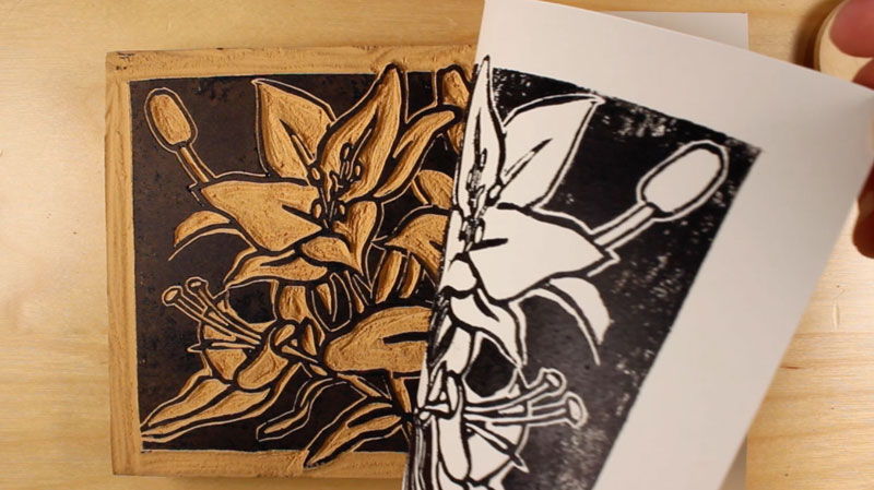
Example of Relief Process

_____________________________________________________________________________

Intaglio Processes

An Intaglio process is any print making process where the image area is below the flat surface of your printing matrix or plate. There are many different versions of the Intaglio process. Some of these Intaglio processes are dry point and etching.

In the dry point process, you directly move or scratch the material on the plate. When scratching the surface, use etching tools. An example of an etching tool is a steel scribe. What you're doing is moving the metal to raise a burr. The ink will later be held on these burrs, creating a fuzzy line. You then use different tools to add texture to the image. An example of a tool that would create texture is the roulette.

In the etching process, you'll use similar tools to the dry point process. First, polish and clean the plate. Next, you'll apply a ground to the plate to act as an acid resist. Once the ground is applied to the plate, the color of the surface should be jet black. Then, you can draw on the plate by scratching the plate. Instead of raising burrs, it'll be scratching away the ground to reveal copper. The copper lines are what will be printed onto the paper. Next, the plate is etched for 15 minutes, rinsed, then etched again for another 15 minutes. All you have to do now is wipe the plate with ink and press paper onto it at high pressure.

See the source image
Example of Intaglio Process

_____________________________________________________________________________

Lithography Process

In Lithography, an artist will draw using a greasy material on a lithographic stone. Lithography revolves around how grease and water resist each other.

Firstly, create a drawing using a greasy material on the stone. Then, you'll apply chemicals onto the stone such as gum arabic to establish the areas where water will go. Rosin and talc will help when you etch the stone. After that, you can draw over the original drawing with things like lithopencils and lithographic crayons. Then, you'll be ready to etch. Apply gum arabic to the non-image areas, then apply acidified gum arabic, then apply more gum arabic. Use a cheesecloth to buff the gum arabic in nice and evenly. Then, wash the stone with lithotine. It will look like your drawing disappeared but it's still there. Next, buff the asphaltum onto the stone. Now, you're done etching the stone. Wetten, dry, sponge, then ink the stone. Then, you force ink into the stone. After 4 to 6 news prints, you'll finally get the full image onto a piece of paper. 

See the source image
Example of Lithography Process