Tuesday, May 22, 2018

4th Quarter Reflection


4th Quarter Reflection


Product and Presentation

The 4th quarter project that was assigned to all students of the eComm program was to create a fake company and make a website and presentation for our company. On the website, we had to include a video advertisement and a 3d model of our product. The project was supposed to take a quarter to finish, and my group used the whole quarter to work. Our biggest challenge this quarter was when we had to make the website, because nobody in our group wanted to make the website and none of us were very good with Dreamweaver. I ended up making the majority of the website but my group still helped me when I needed it. We had to work on the website during Raven50 every day for a week because that was our biggest challenge. During this quarter, the best improvement I made was getting better at Dreamweaver. The only constructive criticism I received this quarter was that I should let my group know when I'm going to be gone in advance. Something that's changed about me this quarter is that I've gotten better at working in a team. My overall opinion of this project is that it wasn't fun, but it was a good learning experience that also improved how I work with a team.

Time Management

I finished everything during class time except for the website which I worked on during Raven50 as well as class time. Whenever I finished something, I didn't do anything productive for the team, although I should have worked on the website. However, I did tell my team when I was done with something. Outside of class, I finished the website using Dreamweaver. At home, I have practiced video editing and photoshop but it wasn't for anything school-related. 

Strengths

During the past school year, my biggest strength has been video production, because it's my biggest passion out everything in eComm. I'm the most motivated to create videos, so I've been trying my best to improve in that area. I do it in my free time, unlike some of the other categories in eComm.

Weaknesses

The part of eComm that I'm worst with is animation, because it's something I don't do outside of school, and I don't plan on taking an animation class. I'm still not very good with website design either but I've done enough with Dreamweaver this quarter to say I'm at least half decent at it. 

Summary

The part I loved most about this quarter was when we first started the project, when we were brainstorming ideas for our company and sketching logos. Something I really wish I had done differently this quarter is that I should have started the website earlier, because we ended up rushing. My overall takeaway of this quarter is that I somewhat know how to make a website now and I've also improved at working in a team. My goal for next year is to improve more in video production because at the start of the year, the only Adobe application I knew how to use was Adobe Photoshop. I didn't know anything about Adobe Premiere so I've been learning the application. My final thought is that I want to continue to improve my skills even more next year.

Work Samples


Coupon

Advertisements


Logos

Banner


3d Model

Website

Home Page


Locations


About Us


Coupon Page


Friday, March 9, 2018

CSS and CARP Design


CSS and CARP Design


Introduction

When I first started this project, I had a blank website. I started off with the text and an image of a dog. I aligned the headings toward the center and I changed it's color to brown. Then, I made an almost white/tan colored box to put my poem and title inside of. I changed some of the fonts to either Georgia or Impact. I also had a black border around the whole thing, with the dog image to the right. There's also a link at the top to my other website page.

CARP

This project represents CARP because there's a lot of color contrast. There’s tan, brown, dark brown, and black, and they go together very well. There’s also contrast with the fonts. The text that is meant to stand out is Impact and the text that shouldn’t stand out but is still noticeable, is in the Georgia font. The alignment of my website is that the headings and tan rectangle are in the middle of the website and all the text is along the left-side of that rectangle. For repetition, the same fonts are used multiple times throughout the website. Some of the same colors are used multiple times as well. The proximity for my website is also well done. The poem is grouped together in paragraphs. The headings are grouped in the middle of the top of the tan box.

What I Learned

During the process of creating this website, I re-learned how to do a lot of web design things that I had forgotten from last quarter. I remembered how to change font, color, size, etc. I was able to edit the text in any way I imagined. I could also move around the text and images to different areas on the page. I already knew plenty about CARP, but this project reinforced what I already knew.

Tuesday, February 27, 2018

My Personality Type


My Personality Type


My Personality

My Myers-Briggs personality type is INFJ. It is the least common personality type in the population. People with INFJ personalities are sincere and sympathetic but they keep to themselves. They are most likely to stay in college and get a high GPA. Many people with the INFJ personality type are religious, and like to be counselors, teachers, or artists. Some famous people with this personality type are Gandhi, Eleanor Roosevelt, and Thomas Jefferson.

Is is Accurate?

I feel like the INFJ personality type describes me pretty well. I am sympathetic, reserved, and easygoing. On the other hand, I don't want to be any of the career choices listed above. 

Misunderstandings

It is very common for people to assume that introverts are shy or they hate people. Some of my friends and family have thought that I'm shy, when in reality I'm not. I used to be shy, which is the cause of the misunderstandings I still get.

Did I Learn About Myself?

A lot of the facts about INFJs, I already knew about myself. I know that I'm introverted and reserved. I know that I'm sympathetic and easygoing. I didn't know that I'll do good in college, and I also didn't know that I'm the rarest personality type.


Monday, February 26, 2018

Sketchup House


Sketchup House


Wall Texture

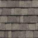
Roof Texture

Scope

When I first started my Sketchup project, the scope of my project was to find a house on houseplans.com that met the requirements. The house had to be big enough and the roof couldn't be flat. I personally didn't want to create too detailed of a house, but it couldn't be too simple either. I finally chose this house: Here

Process

The pre-production process of the Sketchup House was the process of deciding which house I wanted to create. After I opened Google Sketchup, I started off by creating the walls of the House, keeping in mind the measurements displayed on houseplans.com while doing so. Next, I had to make a better roof by putting a line down the center of the roof and pulling it upwards. Next, I created the porch and stairs, which wasn't difficult. The part I struggled with, the most was the windows. Creating the windows took me a couple days because I spent a day creating the window panes and the other day trying to duplicate them across the house. When I made the door, it wasn't that bad, but I did have to create a window on the door. After that, I looked for textures. I needed a blue texture with stripes for the walls and a roof texture. Then, I was finished.


What I Learned

This project taught me how to create a house using Google Sketchup. I gained experience with Google Sketchup and I know more about how to design a house. I also realized that this isn't a field I want to work in.

Friday, December 15, 2017

e9 Website Final


Overview/Process

For my e9 final, I was instructed to design a website with 2 pages about myself and at least 2 projects that I've created so far, this year. I had to have 1 project from first quarter and 1 project from second quarter. On the page about myself, I had to have an image of myself along with a description of what I'm good at. When I first started, I had barely any experience with web design or DreamWeaver. I had a slow start, because DreamWeaver wouldn't work for most of the first day. After that, it worked just fine. Once I finished the first page, I had to make a second page and a link to the second page in the sidebar. The second page featured 2 projects that I've created this year. Next, I created a color scheme. I decided that green and blue would look nice together, so I used different shades of the 2.


What I learned

As I said before, I knew nothing about DreamWeaver or web design when I first started. Along the way, I've learned quite a lot about web design. I learned how to create a web page, and add images and videos to that web page. I learned how to change the font and color of words, along with background colors. Lastly, I now know how to make a link to a second page. After gaining a basic understanding of DreamWeaver, I could probably create my own website without much help.

How I Did

I personally think I did a great job, for my first time tackling web design. There were many times where I was confused, but in the end I learned from my mistakes, so it worked out in the end. There are a few things I'd like to improve, though. The text feels too plain and the color scheme isn't very subtle. Something I do like about my website, is the neatness and organization of it. It doesn't feel too clumped and messy. The headings, subheadings, and labels aren't confusing, which is always important in a website.

Conclusion

In conclusion, I feel like this project has opened up new possibilities for me, in the future. If I ever need to create a website, now I can. The project definitely peaked my interest in web design; beforehand, I thought web design was too confusing, and it'd be really difficult to code. After using DreamWeaver, it no longer seems that way.

Tuesday, December 12, 2017

Elevator Pitch


Elevator Pitch

Hello, my name is Connor Hellwinckel and I am 15 years old. I’m currently a student in the 21st Century
e-communication program at Olathe Northwest High School. If you’re looking for someone to hire, look
no further. I’m skilled and interested in video production. I have experience in working with video editing
software and I have a good understanding of camera angles and techniques when recording with a camera.
I’ve also been using photoshop for a year. I’m a quick learner, and I'm good at self-improvement In
school, I'm relatively good at geometry, Spanish. and e-communication subjects such as video production
and graphic design. If you need to hire someone, consider contacting me through my email or my phone
number. Contact me by calling the phone number, _____, or you could email me through the email, _____.
If you do plan on contacting me, I look forward to meeting with you and discussing a possible job
opportunity for me, and a possible worker for you.

Thursday, December 7, 2017

Logo


Logo Design


Process


I started off by sketching logo ideas on a piece of paper. After I had drawn many logos, I narrowed it down to the best ones. Eventually, I decided on the logo with my initials on it. I made it in Adobe Illustrator, and started off with just a black and white logo. Afterwards, I experimented with my logo to find the best shape, colors, and typeface. Once I was satisfied with a logo, I still tried a few more things to see if I'd like it better. My second logo was my favorite, so it's my final choice.

Meaning

For the colors, I chose to have a green and blue gradient. The blue symbolizes trustworthiness and loyalty. I included green because it's a refreshing and peaceful color. Green is often used positively, and gives a sense of harmony. I used a circle for the logo because they tend to suggest friendship, unity, and other positive messages. For the font, I just tried to not use a font with serifs, because those make words look less energetic.